Redesigned the user interface for Hosplan
Role:
Designed wireframes and prototypes, Collaborated with developers,
Industry:
Healthcare
Duration:
22 weeks
Challenges
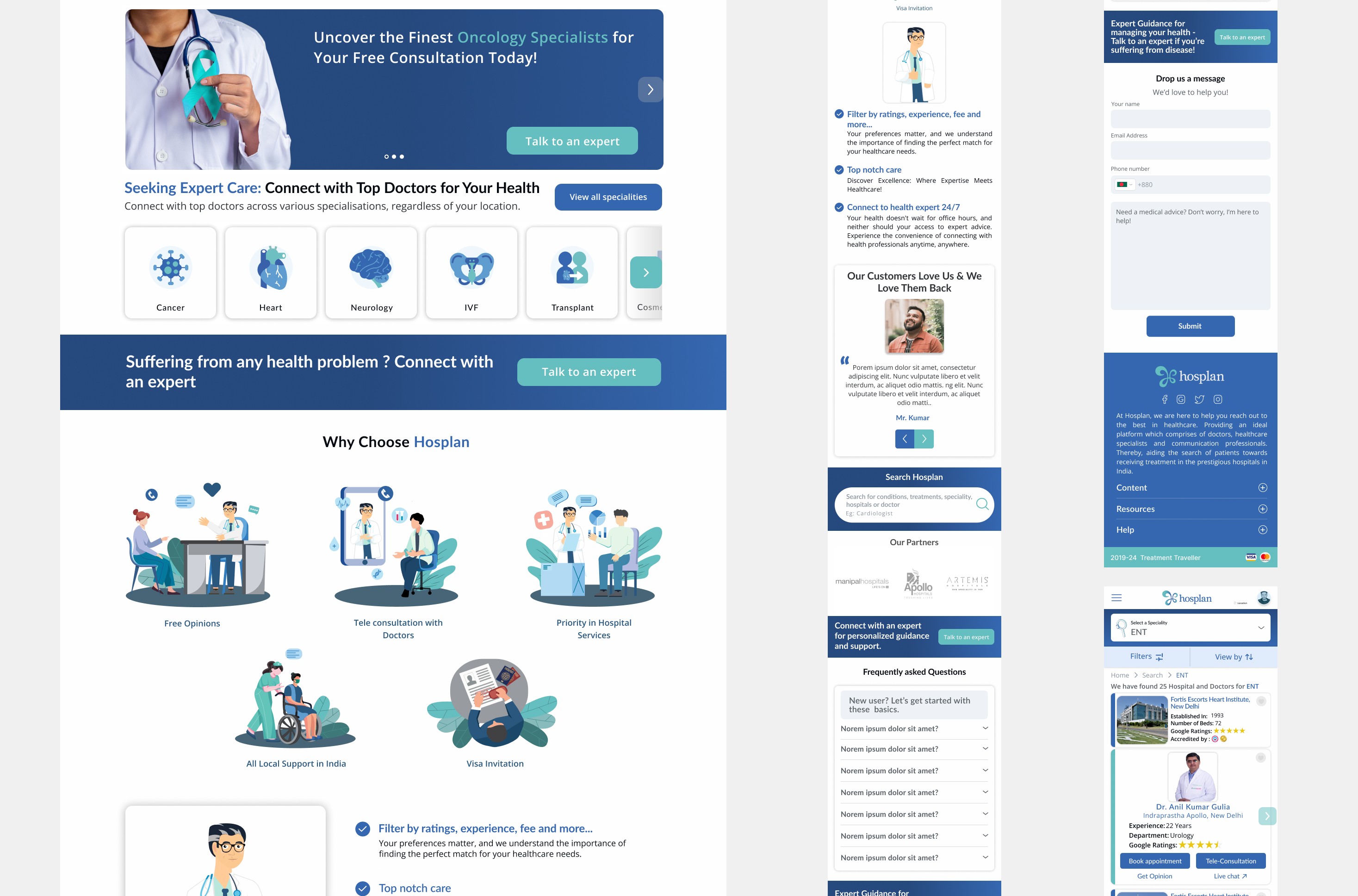
Hosplan's product is designed to assist patients in understanding their medical conditions and making well-informed treatment decisions. By leveraging a vast network of specialized physicians, the product provides patients with access to experts in specific medical fields, particularly for complex tertiary and quaternary diseases. The product offers detailed information about hospitals that excel in the required treatments, including Google ratings, experience, education, availability, fees, and hospital brand. This comprehensive data helps patients choose the best healthcare providers for their unique needs.
My Approach
User-Centered Design
Such as we start to understand the patient needs when users navigate through the website—they are often very stressed and anxious about their health concerns—so we focused on creating a calming, reassuring experience. This was achieved by using light, soothing color palettes, clear typography, and clean, uncluttered layouts. Our goal was to build a design that not only looked visually appealing but also put users at ease by reducing cognitive load and supporting their decision-making processes.
We carefully considered the unique needs of different user groups: patients seeking reliable information, doctors looking to manage their schedules, and hospital staff navigating large datasets. By mapping out detailed user flows and journey maps for each group, we identified their pain points and how the interface could better support their tasks. For patients, this meant ensuring that the homepage prominently displayed search options and live chat support to quickly address their concerns. For doctors, it meant designing intuitive dashboards where they could track appointments and tele-consultations seamlessly.
We also incorporated clear and consistent brand elements from the established guidelines to maintain trust and build credibility. This involved choosing colors and fonts that aligned with Hosplan’s brand identity while supporting readability and accessibility across devices. Every design decision was guided by empathy for the users’ contexts and needs—whether they were in urgent need of medical care, researching complex treatments, or trying to find a trustworthy specialist.Testing and Iteration.
Results
To ensure our designs truly met users’ needs, we adopted a rigorous process of testing and iteration. This started with creating wireframes and low-fidelity prototypes in Figma, which we shared with team members and stakeholders to gather early feedback. Through multiple design critiques, we refined the visual hierarchy and navigation flows, paying close attention to how users interacted with the interface.
We explored different layouts for key pages, such as the home page, search results, and doctor profiles, testing various arrangements to ensure the most important information was always easy to find. For example, we experimented with different placements of the search bar and filters to see which configuration reduced search time for users. Similarly, on the doctor’s profile page, we prioritized appointment booking and live chat options to ensure users could take action quickly.
My Approach
Teamwork & Communication: Collaborating with a multidisciplinary team helped me appreciate different perspectives and improve my communication skills.
Tools Mastery: I became proficient in using Figma and Miro for prototyping, wireframing, and collaborative design work.
Branding Integration: Working on brand guidelines taught me how to incorporate a company’s identity seamlessly into product design.
Problem-Solving: I developed a keen eye for identifying usability issues and iteratively improving them based on real feedback.
Conclusion
My internship at Treatment Travellers was a transformative experience where I combined creativity with strategic thinking to improve digital healthcare accessibility. By focusing on user-centered design and collaborating with an incredible team, I not only sharpened my design skills but also gained a deeper understanding of how thoughtful, accessible design can bridge the gap between patients and essential healthcare services